VIRTUAL MEMORY BOX

Nebula Labs 2023 - University Placement

Virtual Memory Box is a digital platform supporting young people in care aged 5–25, designed to preserve meaningful memories in a safe, personal space.

The brief was to design a fully clickable prototype supported by a complete brand system, including brand guidelines, logo design, social media assets, marketing site visuals, and in-app UI components.

Character Designs

These characters were designed as mascots for Virtual Memory Box, created to introduce warmth, approachability, and emotional safety to a digital platform for young people in care.

Created in Illustrator, the mascots were designed to be expressive, inclusive, and adaptable across digital touchpoints, including web, social content, and motion.

Friendly expressions and non-literal forms were chosen to avoid age-specific cues, helping the characters feel welcoming to both children and young adults.

Friendly expressions and non-literal forms were chosen to avoid age-specific cues, helping the characters feel welcoming to both children and young adults.

Mascots were introduced to soften the experience and make the platform feel less institutional. The characters provide personality while helping younger users feel more comfortable engaging with the platform.

Mascots were introduced to soften the experience and make the platform feel less institutional. The characters provide personality while helping younger users feel more comfortable engaging with the platform.

Branding Choices

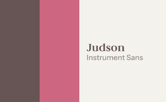
Website: warm, comfortable colours paired with a gentle serif & contemporary sans serif.

Judson was chosen particularly for it's subtle editorial quality, reinforcing the reflective nature of personal memories.

Illustrations: Fun colours to compliment the website and bring the mascots to life.

Logo Design

Homepage Redesign

Before
After

This redesign shifts the interface away from a clinical aesthetic toward a calmer, more human-centred experience that better reflects the emotional nature of storing personal memories. The updated layout introduces stronger visual hierarchy, clearer navigation, and more intentional spacing to help users focus on their content rather than the interface itself.

Key actions such as searching, filtering, and adding new memories are now more clearly prioritised, with a prominent search field and a dedicated “New Memory” call to action. The card layout was simplified to improve scannability and create a consistent rhythm across the grid, allowing users to browse memories more comfortably.

Visual styling was softened through lighter backgrounds, rounded elements, and improved contrast, creating a more welcoming and accessible environment. Spacing, typography, and colour contrast were also refined to better align with WCAG accessibility principles, ensuring the interface remains readable and easy to navigate for a wider range of users.

Overall, the redesign prioritises emotional comfort, clarity, and usability, supporting users in capturing and revisiting meaningful moments with minimal friction.

This redesign shifts the interface away from a clinical aesthetic toward a calmer, more human-centred experience that better reflects the emotional nature of storing personal memories.

The updated layout introduces stronger visual hierarchy, clearer navigation, and more intentional spacing to help users focus on their content rather than the interface itself.

Key actions such as searching, filtering, and adding new memories are now more clearly prioritised, with a prominent search field and a dedicated “New Memory” call to action. The card layout was simplified to improve scannability and create a consistent rhythm across the grid, allowing users to browse memories more comfortably.

Visual styling was softened through lighter backgrounds, rounded elements, and improved contrast, creating a more welcoming and accessible environment. Spacing, typography, and colour contrast were also refined to better align with WCAG accessibility principles, ensuring the interface remains readable and easy to navigate for a wider range of users.

Overall, the redesign prioritises emotional comfort, clarity, and usability, supporting users in capturing and revisiting meaningful moments with minimal friction.

Reflection

This project highlighted how thoughtful design can support emotionally sensitive experiences. Balancing branding, illustration, and interface design helped create a cohesive product that feels welcoming rather than institutional.

It made me really reflect upon how products can affect users, and how important it is to design around needs and usability rather than aesthetics.